Rebuilding a Local Bank’s App
Jul 6, 2023

Start to Finish: Rebuilding a Local Bank’s App for the Modern User
A Hands-On Journey Through Usability Overhaul: Rethinking Features, Streamlining Navigation, and Uplifting Aesthetics for a User-Focused Banking App
Introduction
My journey with mobile banking started when I began earning, and apps became my primary tool for financial management. Many apps, unfortunately, seem stuck in a design time capsule. As I delved into the world of UI/UX design, I took on a project to rejuvenate a local bank's mobile application.
The Issue
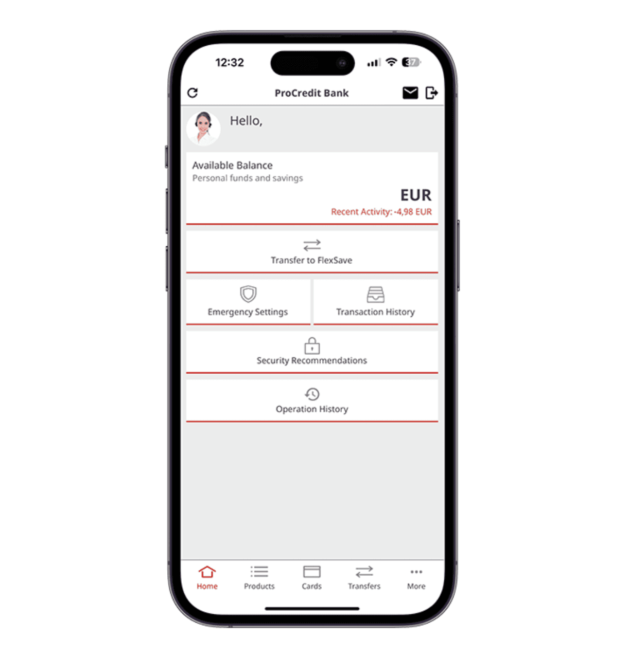
First impressions matter. Upon opening the app, the Home Screen felt like a throwback to a decade ago. An easy-to-mistap “Log Out” button loomed at the top, while a recurring, over-familiar greeting seemed superfluous after just a few log-ins. Features that users might seldom access, like “Security Recommendations”, felt out of place on the primary screen. Mislabeling, such as the puzzling “Products” tab, and inconsistencies in design, particularly in the “Transfers” section, added to the user's navigational burden.
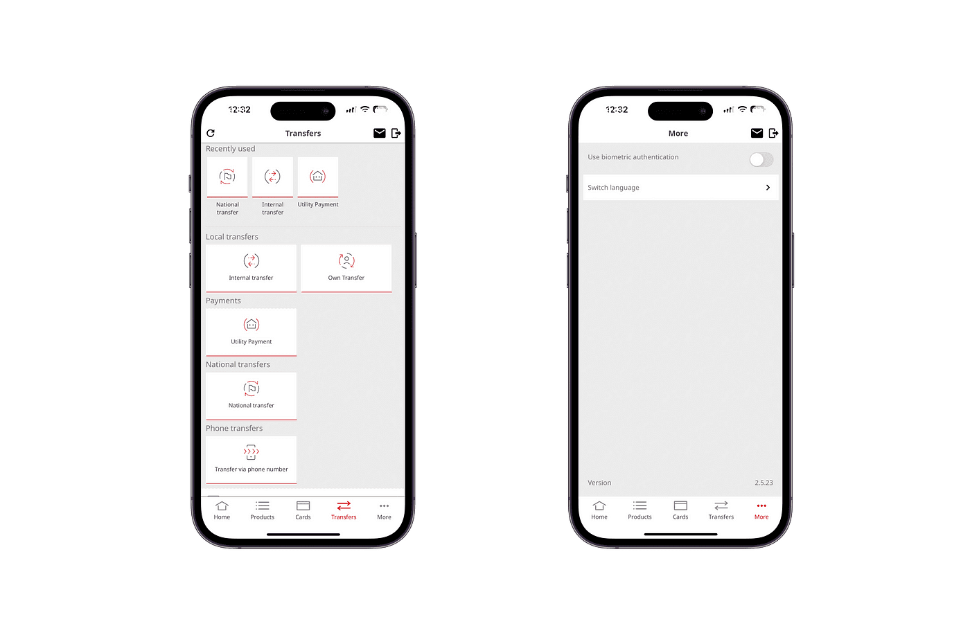
Navigation can also be challenging on screens. The second item on the navigation bar is labeled “Products,”. Its contents. Accounts, term deposits and loans. Don’t align with its name. This mismatch can confuse users. Moving to the “Transfers” section there’s a spacing, between transfer cards. Additionally once a transaction is completed users are shown a Used” transfer form.
Lastly there’s a tab labeled “More” on the navigation bar.
On this screen users will only find options such, as “Enable Biometric Authentication” and “Switch Language.” There aren’t any settings for user accounts, profiles or notification preferences.
Solution
Decluttering the Interface: The “Log Out” button was retired in favor of a modern pull-down-to-refresh gesture.
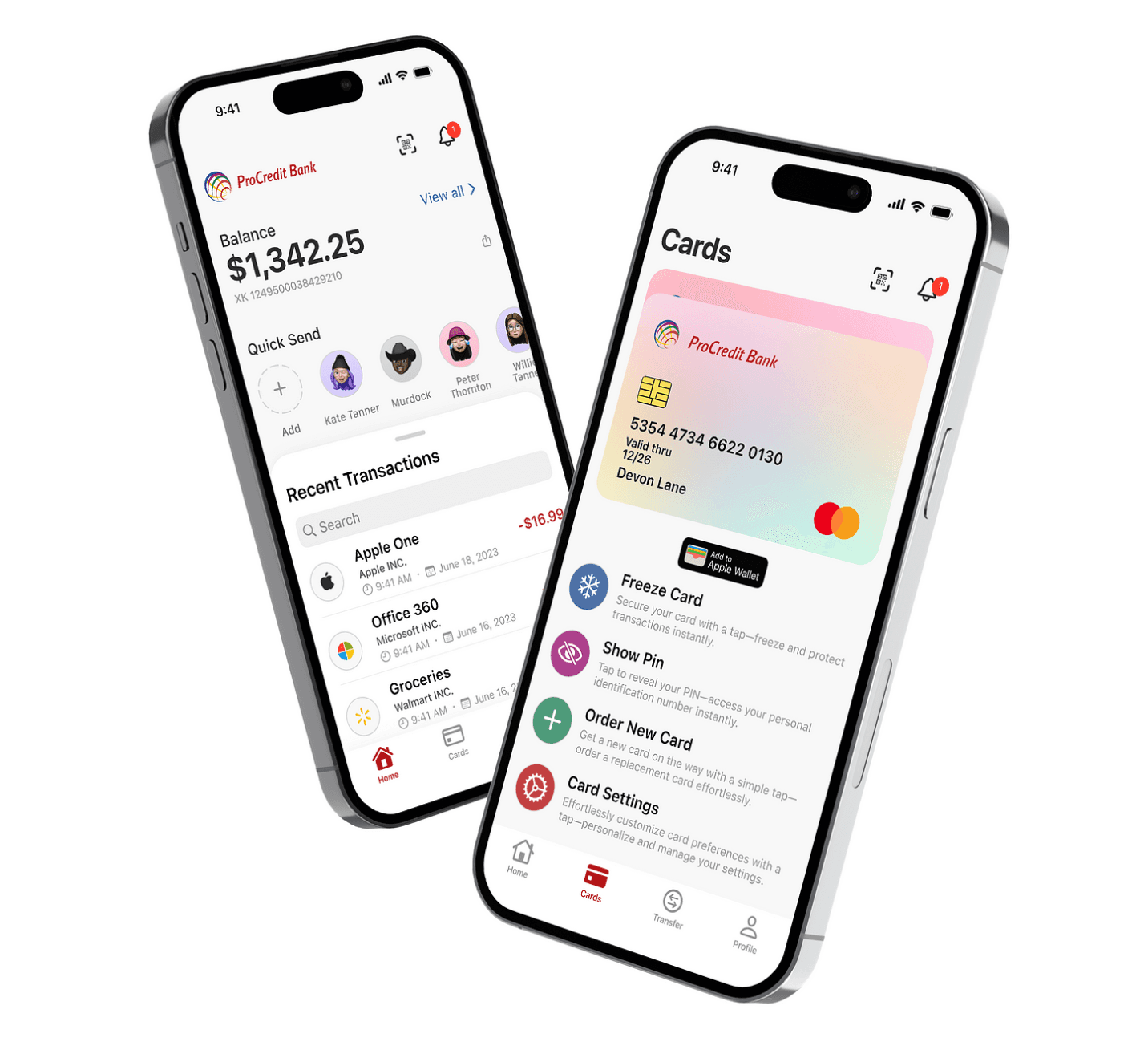
Reorganisation: I felt an urgent need to streamline. “Security Recommendations” and “Emergency Settings” were relocated, freeing the Home Screen from excess. Features were reallocated logically: card-specific functions like freezing a card or PIN changes were nested under the “Cards” umbrella.
Refined Navigation: The ambiguous “Products” tab was dissolved. Its features found new, intuitive homes. The ease of toggling between accounts via simple card taps was introduced, complemented by a detailed loan section.
Transfer Facelift: The transfer process was revisited. Users could now categorize transfers as Private or Organisational , simplifying the process. Quick pay options and setups for recurring payments were integrated for efficiency.
Profile Enhancement: The ambiguous “More” tab metamorphosed into “Profile”. This section was not just about viewing user details but providing an interactive space where users could tailor their app experiences.
User Research and Insight
When it comes to user research and insights conducting research is crucial if you genuinely care about enhancing the user experience. To conduct my research I decided to create a questionnaire using Google Forms. Shared it on my social media platforms for people to participate.
As I expected most people prefer using banking apps on their phones. Therefore I designed the app with a format in mind. Based on the responses from this questionnaire I found that people primarily use banking apps for checking balances reviewing transaction history making money transfers and paying bills. These features should be easily accessible either on the Home Screen or through a tab in the navigation bar.
On the hand according to my research findings, one of the used features is the ATM locator. This suggests that it can be placed in a area, within the app.
According to the survey users face difficulties when using banking apps. These include loading times, complicated navigation, limited functionality, complex verification processes and concerns, about security. Additionally many users feel that banking apps lack intuitiveness and a structured layout resulting in decreased usage.
Brainstorm & First Sketches
To begin the design process I first organized all the apps features on a mind map to understand how different screens relate to each other and where each element should be placed.
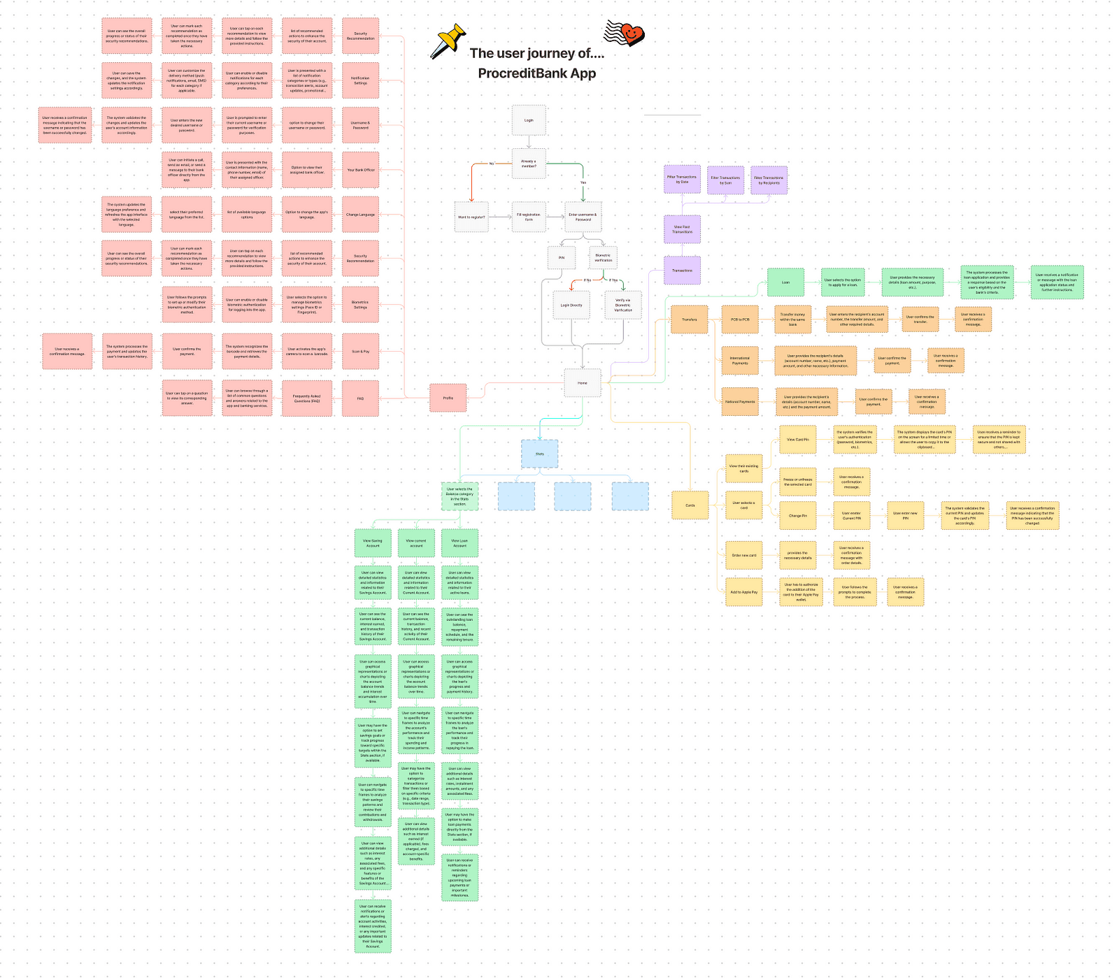
For sketching the designs and wireframes of the app I chose to go digitally as it allows for more freedom compared to using pen and paper. Once the wireframes are completed and the overall look of the app is finalised I can proceed with its design.
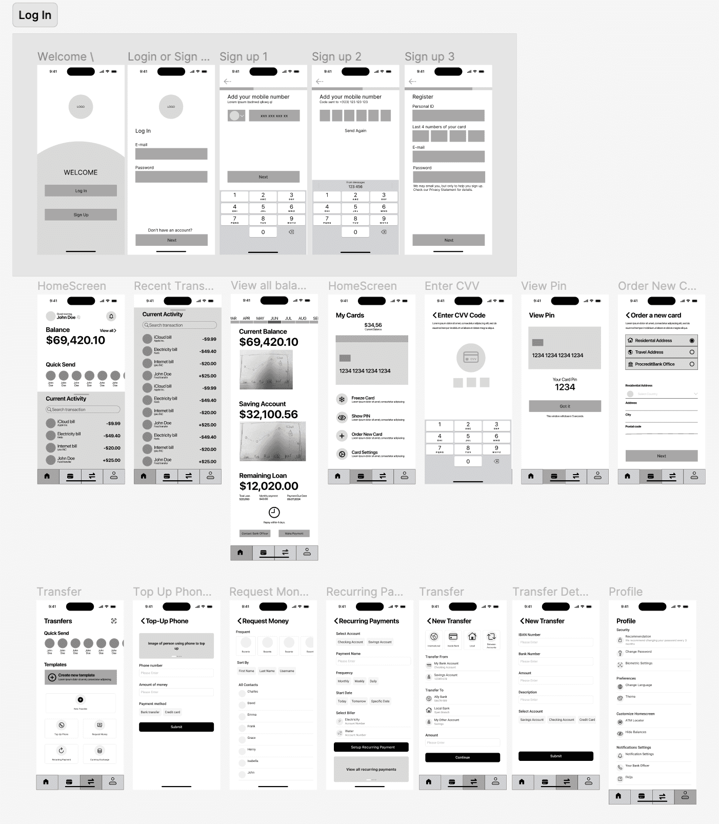
With branding and logo established designing becomes much easier. The updated default version of the app follows a Light Mode, like its version. The brand colours are consistently incorporated throughout every screen of the app.
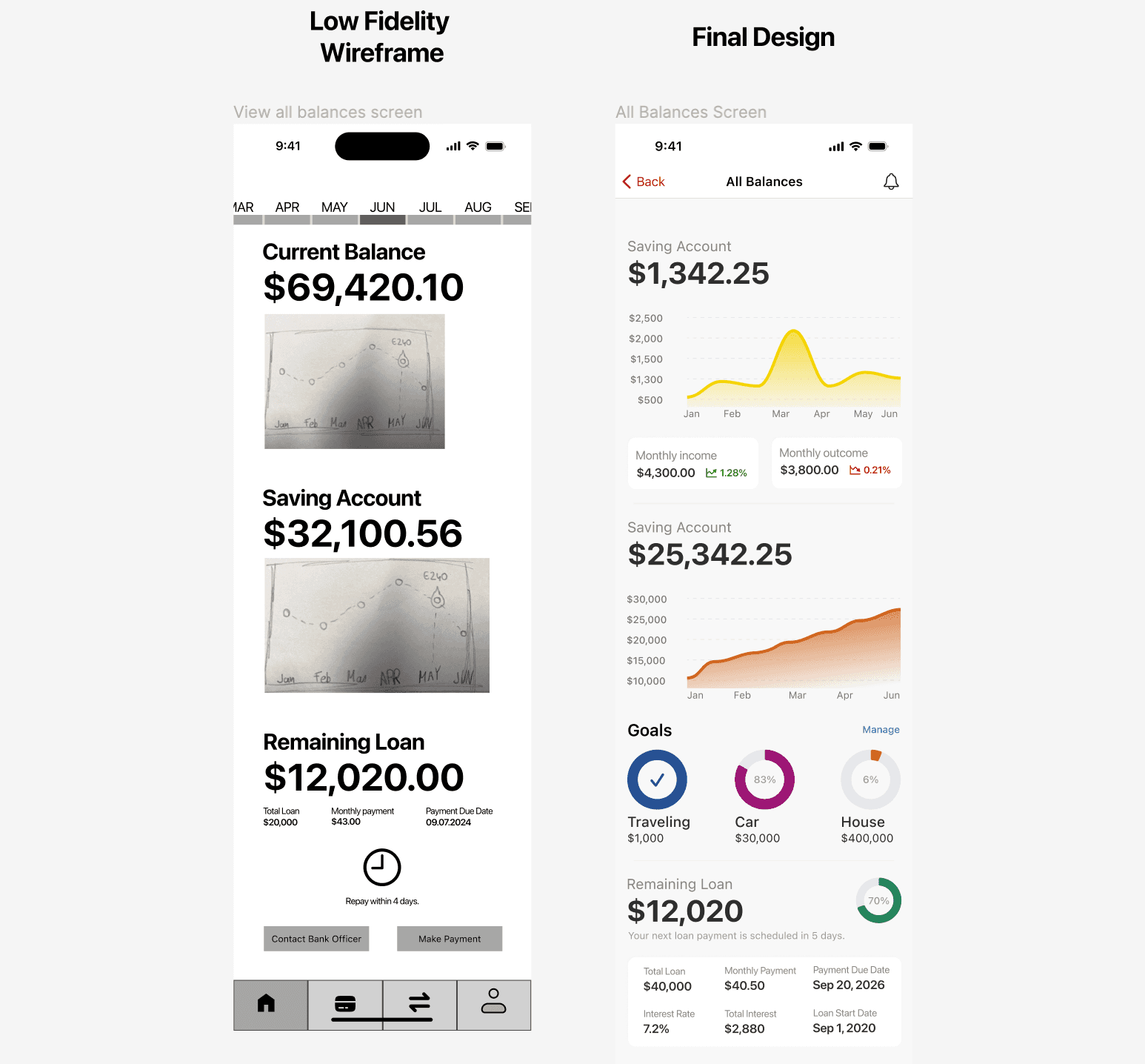
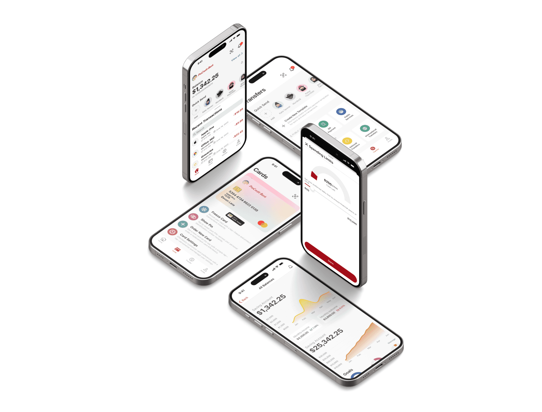
Final Design
One challenge that stood out was the brand's predominant red hue, which often evokes caution or errors in the digital space. This necessitated a design rethink. Through careful color balancing and smart design choices, the brand colors were harmoniously blended into the interface, making features stand out without evoking unintended connotations. The outcome? An app that resonates with modern aesthetics while ensuring an enhanced user experience.