Designing My First Book Cover
Dec 10, 2022
Introduction
My name is Korab Gashi. I work as a UX designer, with an emphasis on digital products. Recently I encountered an opportunity; creating a book cover for my friends guide on UX design. Although this was my venture into the realm of book cover design I applied the principles that have guided me throughout my career in user experience. In this case study I will share the journey of how I transitioned my expertise into this domain covering everything from initial research, to the final product.
Problem Definition
Creating a user interface is the core of UX design. It's important to ensure that the interface not looks good but functions well and is easy to understand for the user. This principle holds true for book covers as they are the point of contact, between a book and its potential readers. The task, at hand was to incorporate these principles into a book cover that would attract attention and provide information.
Research and Initial Exploration
Market Research
Before sketching even began, I wanted to understand the landscape. I conducted research on prevailing trends in book cover design, especially those in design and technology genres. This helped me identify what visual elements and styles are effective in engaging a design-savvy target audience.
I also spent time discussing the book's subject, audience, and objectives with the author. This provided me with valuable contextual information, aiding me in aligning the cover design closely with the content.
Ideation and Sketching
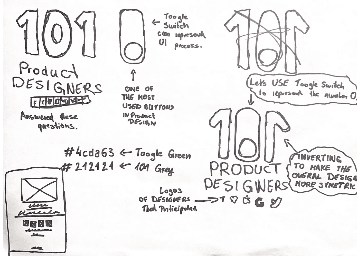
Armed with the research I began brainstorming ideas. My main aim was to create an uncomplicated design, like a beautifully crafted user interface. I went through rounds of refining my sketches incorporating feedback and critically evaluating them along the way.

First Draft and Preliminary Design
The initial version appeared like a framework, for the cover design. It had the structure in place. Was missing the polished aesthetic details that would give it a finished look. Although the overall layout and essential elements were set there was still work to be done in terms of refining the aspects such as color schemes, typography and fine tuning the elements. This preliminary draft serves as a starting point, for iterations and improvements.

Final Product
The final design was a minimalist piece, accented by selective pops of colour. It incorporated clean lines and a modern aesthetic, in line with contemporary design principles. I felt that this design effectively communicated the subject matter of the book while also resonating with its target audience.

Lessons Learned and Conclusion
This project presented an opportunity, for growth and learning. I had to adapt my UX design skills to a medium that I hadn't worked with before. What really stood out to me was how the fundamental principles of design—keeping things simple focusing on the user and creating experiences—applied seamlessly across various platforms.
I feel fortunate to have had this experience. I'm excited to apply what I've learned in design projects.


